[special_heading2 title_content= “Eden Online Support” h_tag= “h1” title_color= “” border_color= “” border_thickness= “0” padding= ‘{“d”:”0px 30px 0px 30px “}’ margin= ‘{“d”:””}’ title_alignment= “center” hide_in= “” css_id= “” css_classes= “” animate= “1” animation_type= “none” animation_delay= “0” animation_duration= “300” box_shadow= “0px 0px 0px 0px rgba(0,0,0,0)” separator_thickness= “1” key= “foa22oxbfnaf7r5l”][/special_heading2]
UX & UI DESIGN | RESEARCH
PROJECT/DATE: EDEN ONLINE SUPPORT | 2016
TOOLS: PAPER & PEN | SKETCH
ROLE & RESPONSIBILITY: UX DESIGNER | REDESIGN LANDING PAGE
Visit Site

00 OVERVIEW

Eden is a online community for patients & families affected by and living with chronic illnesses. Eden’s goal is to create community forums where users are able to connect with others dealing with similar illnesses, share personal stories, find expert articles, and clinical trial information.


01 CHALLENGES

There are many competitors (WebMD, Facebook Groups, Patients Like Me, Quora and Inspire) in this space that offer a variety of information and resources but users will have to jump between them with the hope to find the information they’ll need. Thats where Eden feels they can have success! Combining all support services into one platform and make the information easily accessible when needed.


02 PROBLEMS

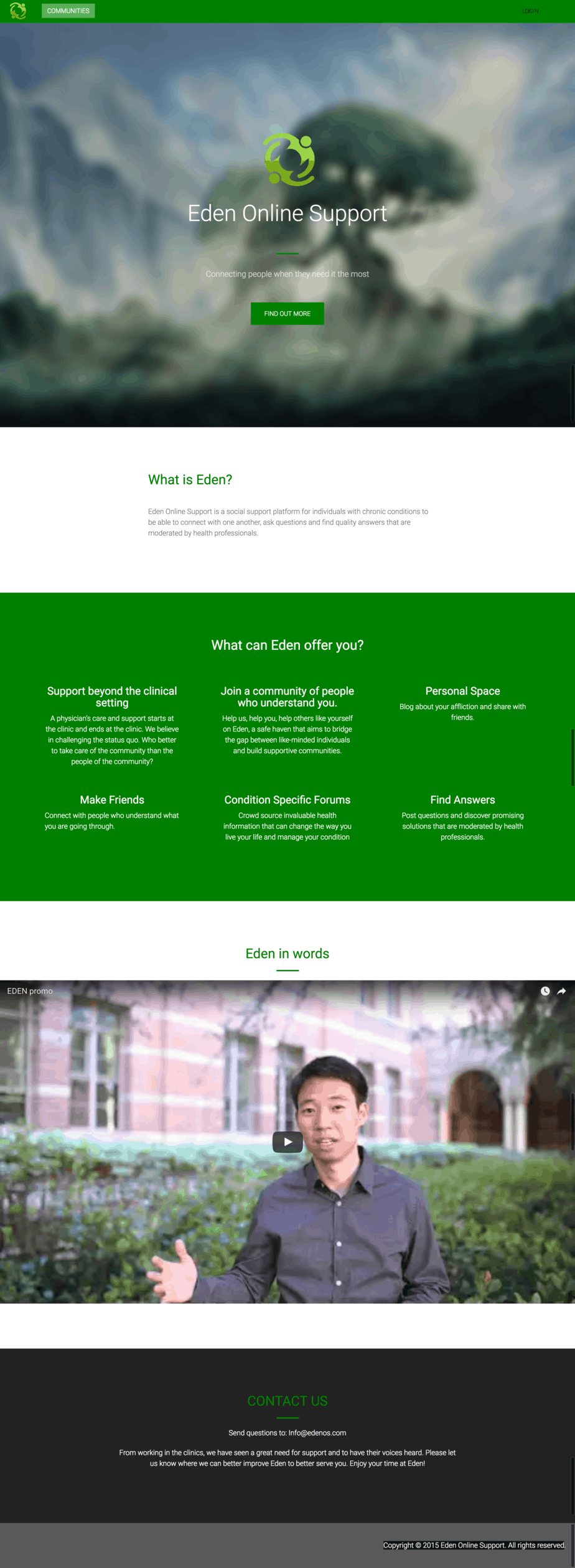
There were a couple issues with the original landing page.                                                                                                         – Login area is difficult to find                                                                                                                                                             – No clear Call-to-Action                                                                                                                                                                     – Introduction video at the bottom of the page                                                                                                                               – Tons of scrolling                                                                                                                                                                               – Poor font selection makes reading content difficult                                                                                                                   – Overall the site is dark, drab and depressing

SCROLLING

Hard to find login area
CTA not clear and easy-to-see
Intro video towards the bottom of page

03 SOLUTION

I really enjoyed working on this project. The changes instantly made a huge difference and garnered great feedback from users.

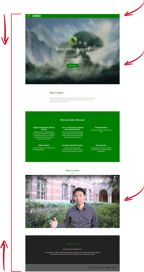
You’ll notice that the new design is brighter and much more vibrant than before. Also you’ll see that I was able to shorten the length of the page all while adding more information.

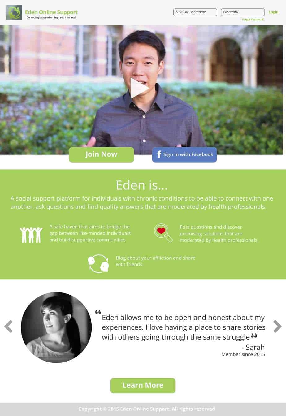
⬅︎ Clear, prominent login input fields

⬅︎ Introductory video at the top welcoming new users to the site

⬅︎ CTA’s clearly visible

⬅︎ Clear & Precise Informational section

⬅︎ New Testimonial Section

⬅︎ Repeat of CTA


Privacy Settings
We use cookies to enhance your experience while using our website. If you are using our Services via a browser you can restrict, block or remove cookies through your web browser settings. We also use content and scripts from third parties that may use tracking technologies. You can selectively provide your consent below to allow such third party embeds. For complete information about the cookies we use, data we collect and how we process them, please check our Privacy Policy
Youtube
Consent to display content from - Youtube
Vimeo
Consent to display content from - Vimeo
Google Maps
Consent to display content from - Google